Caedes
Upload Images
Welcome guest
Log In or Register
User Stats
- 1 total users online
- 30 users active today
- 259282 total members
- +show users online
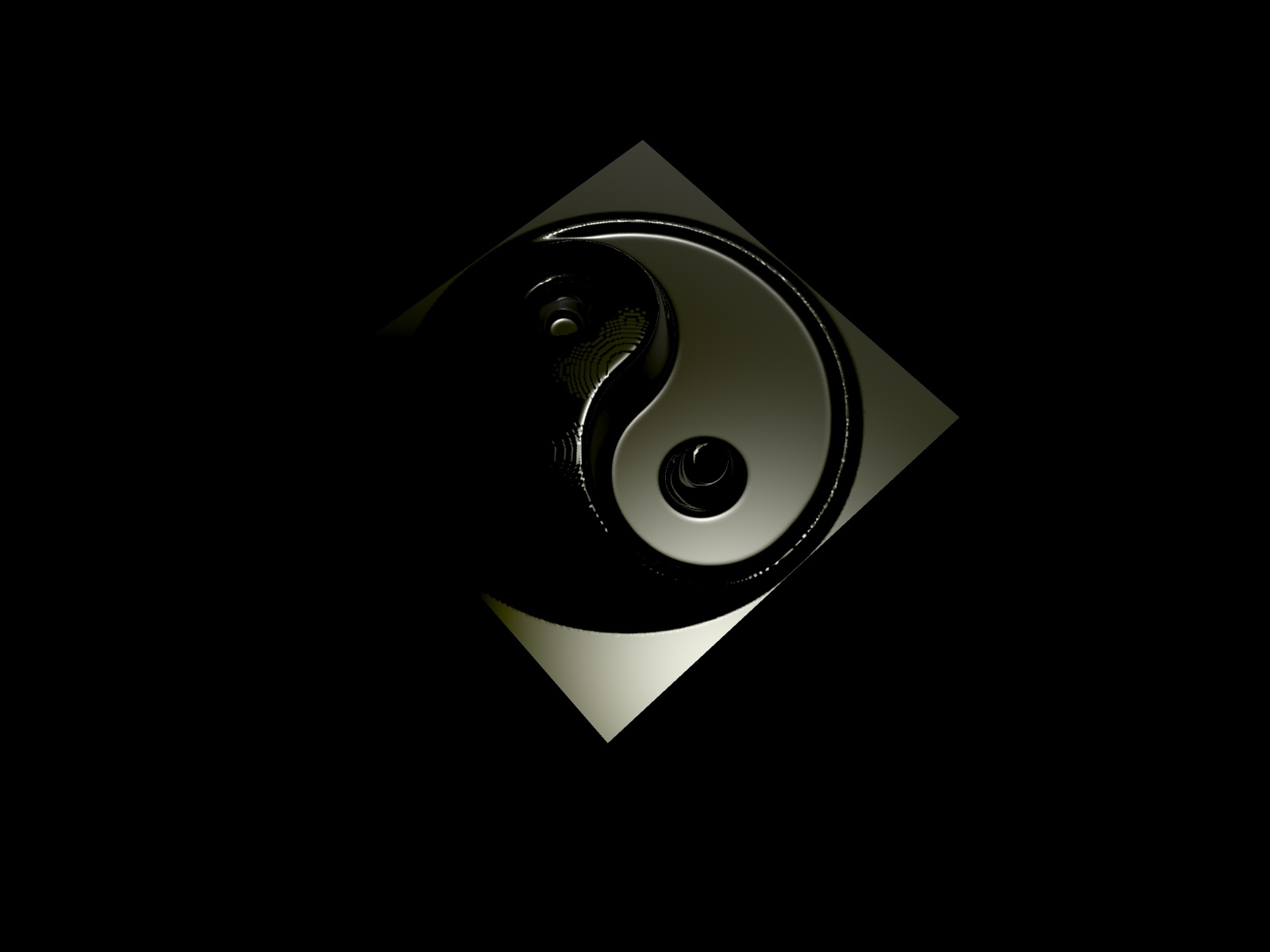
Yin & Yang - Gelsquared
© Paws_of_GT
(copyright information)
Uploaded: 07/13/04 10:26 AM GMT
Yin & Yang - Gelsquared
Views: 16812
Dlds: 8364
Status: active
Dlds: 8364
Status: active
Gallery:
(Main) Computer->3D
0-o
Comments
Post a Comment - Subscribe to this discussion
icenine

07/13/04 11:34 AM GMT
This is an interesting image maybe a little dark for a background but personally I like the idea well done
0∈
[?]
- pixels are only the beginning unless you started at the end -
dark is good - there appears to a few rendering artefacts around some edges but that is the only thing that spoils it for me - otherwise - an excellent piece.
0∈
[?]
"Some mornings, it's just not worth chewing through the leather straps"
I agree with Phil. I love the image, simplicity, and how you accomplished the texture! The edges are a little rough and gives it a slight blur into the background.
0∈
[?]
B.J. ;)
Awesome. This makes such a great desktop. Kudos to you and in my favorites.
0∈
[?]
Cheers. It's kileychristine!
Looks good. I love the textures. It looks a little dark on the left, but it looks intentional, so there must be a good reason for that. I personally like dark and simple desktops. Good idea. I like how you put it in a square, gives more to the image.
0∈
[?]
~You can't make footprints in the sand of time if you are sitting on your butt, and who wants to make buttprints?
Look's like a side of a dice.
I like it, and made it my desktop :-)
I like it, and made it my desktop :-)
0∈
[?]
Clean and crisp..I like dark BG's on my desktop. Not overdone...nice.
0∈
[?]
Art washes away from the soul the dust of life....Picasso
Oo0o0o0ooo0o0o0hhhhhhhhhh........this is a pretty image. Love the way it looks. ^_^
0∈
[?]
~* Reality is as far as the mind is willing to go*~